Getting Started with dashboardr
getting-started.RmdThis vignette walks you through building your first interactive dashboard with dashboardr. By the end, you’ll understand the core concepts and have a working dashboard you can customize.
📦 What is dashboardr?
dashboardr lets you build interactive HTML dashboards from R using a simple, composable grammar.
📥 Installation
Install dashboardr from GitHub:
devtools::install_github("favstats/dashboardr")This tutorial uses the gssr package for General Social
Survey data. Install it from r-universe:
install.packages('gssr', repos = c('https://kjhealy.r-universe.dev', 'https://cloud.r-project.org'))

# Also recommended: install gssrdoc for documentation
install.packages('gssrdoc', repos = c('https://kjhealy.r-universe.dev', 'https://cloud.r-project.org'))
🏗️ What We’ll Build
To showcase what dashboardr can do, we’ll create a
dashboard exploring the General Social Survey (GSS),
a long-running survey of American attitudes and demographics. We’ll
build charts showing education levels, happiness, and how they relate to
each other.
First, let’s load the packages and prepare our data:
library(dashboardr)
library(dplyr)
library(gssr)

# Load GSS data and select relevant variables (latest wave only)
data(gss_all)

# Define GSS-specific NA values to filter out
gss_na_values <- c("iap", "dk na", "dk, na, iap", "no answer", "skipped on web",
                   "don't know", "refused", "not imputable", "I don't have a job")

gss <- gss_all %>%
  select(year, age, sex, race, degree, happy, polviews) %>%
  filter(year == max(year, na.rm = TRUE), !is.na(age), !is.na(sex), !is.na(race), !is.na(degree)) %>%
  filter(!tolower(happy) %in% tolower(gss_na_values),
         !tolower(polviews) %in% tolower(gss_na_values))
We now have a dataset with about 3139 respondents from 2024 onwards, with variables for demographics (age, sex, race, education) and attitudes (happiness, political views).
🧱 Core Concepts
Just as ggplot2 builds plots from layers (data, aesthetics, geoms), dashboardr builds dashboards from three layers:
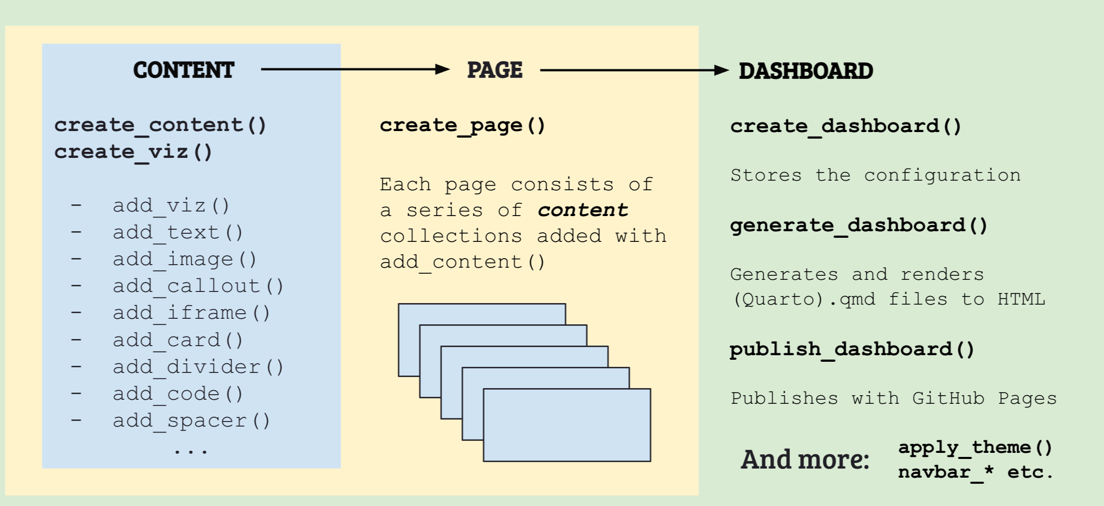
| Layer | Purpose | Key Functions |
|---|---|---|
| Content | What to show |
create_content(), add_viz(),
add_text()
|
| Page | Where content lives |
create_page(), add_content()
|
| Dashboard | Final output + config |
create_dashboard(), add_pages()
|
Each layer flows into the next using pipes (%>%),
making your code readable and modular.
Layer 1: Content
Content collections hold your visualizations, text, and more
(iframes, custom HTML). You create one with
create_content(), passing the data and a default chart
type:
demographics <- create_content(data = gss, type = "bar") %>%
  add_viz(x_var = "degree", title = "Education",
          x_label = "", y_label = "Respondents")

print(demographics)
#> -- Content Collection ──────────────────────────────────────────────────────────
#> 1 items | ✔ data: 3139 rows x 7 cols
#>
#> • [Viz] Education (bar) x=degree
Here create_content() sets up a container with the GSS
data (data = gss) and says “make bar charts by default”
(type = "bar"). Then add_viz() adds a bar
chart of the degree variable. The print output shows what’s
inside: one visualization ready to go.
Use preview() to see the actual chart. Note this differs
from how content will eventually look like in your dashboard as it
creates a simple preview of your data.
You can keep adding to content collections. Use tabgroup
to organize charts into tabs. The code below will crate two tabs, one
titled “Demographics” and one titled “Attitudes”.
demographics <- create_content(data = gss, type = "bar") %>%
  add_viz(x_var = "degree", title = "Education", tabgroup = "Demographics",
          y_label = "Count") %>%
  add_viz(x_var = "happy", title = "Happiness", tabgroup = "Attitudes",
          color_palette = c("#27AE60", "#F39C12", "#E74C3C"))

demographics %>% preview()Layer 2: Pages
Pages organize content and define your dashboard’s navigation. Each page becomes a separate HTML file.
Let’s create something every dashboard needs: a simple landing page:
home <- create_page("Home", is_landing_page = TRUE) %>%
  add_text(
    "# Welcome!",
    "",
    "Explore the General Social Survey data.")

home %>% preview()Explore the General Social Survey data.
With add_text you can just provide a series of markdown
code! A "" marks a linebreak. The
is_landing_page = TRUE makes this the default page when
someone opens your dashboard.
Now an analysis page that uses our content from Layer 1. If you like
you can also add_text directly to pages:
analysis <- create_page("Analysis", data = gss) %>%
  add_text("## Demographic Overview", "Explore how GSS respondents break down by key categories.") %>%
  add_content(demographics)

print(analysis)
#> -- Page: Analysis ───────────────────────────────────────────────
#> ✔ data: 3139 rows x 7 cols
#> 3 items
#>
#> ℹ [Text] "## Demographic Overview Explore how GSS respond..."
#> ❯ [Tab] Demographics (1 viz)
#>   • [Viz] Education (bar) x=degree
#> ❯ [Tab] Attitudes (1 viz)
#>   • [Viz] Happiness (bar) x=happy
The add_content() function connects layers: it takes the
content collection you built earlier and attaches it to the page. The
page’s data argument provides the dataset for any
visualizations that need it.
Explore how GSS respondents break down by key categories.
You can also add visualizations directly to pages without creating a separate content collection first:
quick_page <- create_page("Quick", data = gss, type = "bar") %>%
  add_text("## Quick Analysis") %>%
  add_viz(x_var = "happy", title = "Happiness Levels")

quick_page %>% preview()Layer 3: Dashboard
The dashboard brings pages together and configures the final output. You specify where to save files, pick a theme, and add your pages:
my_dashboard <- create_dashboard(
  title = "GSS Explorer",
  output_dir = "my_dashboard",
  theme = "cosmo"
) %>%
  add_pages(home, analysis)

print(my_dashboard)
#>
#> 📊 DASHBOARD PROJECT ====================================================
#> │ 🏷️  Title: GSS Explorer
#> │ 📁 Output: my_dashboard
#> │
#> │ ⚙️  FEATURES:
#> │    • 🔍 Search
#> │    • 🎨 Theme: cosmo
#> │    • 📑 Tabs: minimal
#> │
#> │ 📄 PAGES (2):
#> │ ├─ 📄 Home [🏠 Landing]
#> │ └─ 📄 Analysis [💾 1 dataset]
#> ══ ═════════════════════════════════════════════════════════════════════════
Pages appear in the navbar in the order you add them.
To generate the final HTML dashboard:
my_dashboard %>%
  generate_dashboard(render = TRUE, open = "browser")
This creates Quarto files, renders them to HTML, and opens the result in your browser.
You can also preview dashboards without generating everything with Quarto:
Explore the General Social Survey data.
⚡ Your first Dashboard in 1 Minute
Here’s everything together, from data to published dashboard. Just copy paste, run it, and you will have your first dashboard:
library(dashboardr)
library(dplyr)
library(gssr)

# Prepare data (latest wave only)
data(gss_all)

# Define GSS-specific NA values to filter out
gss_na_values <- c("iap", "dk na", "dk, na, iap", "no answer", "skipped on web",
                   "don't know", "refused", "not imputable", "I don't have a job")

gss <- gss_all %>%
  select(year, age, sex, race, degree, happy, polviews) %>%
  filter(year == max(year, na.rm = TRUE), !is.na(age), !is.na(sex), !is.na(race), !is.na(degree)) %>%
  filter(!tolower(happy) %in% tolower(gss_na_values),
         !tolower(polviews) %in% tolower(gss_na_values))

# LAYER 1: Build content collections
demographics <- create_content(type = "bar", y_label = "Count") %>%
  add_viz(x_var = "degree", title = "Education", tabgroup = "Overview") %>%
  add_viz(x_var = "race", title = "Race", tabgroup = "Overview") %>%
  add_viz(x_var = "sex", title = "Gender", tabgroup = "Overview")

cross_tabs <- create_content(type = "stackedbar",
                             y_label = "Percentage",
                             color_palette = c("#27AE60", "#F39C12", "#E74C3C")) %>%
  add_viz(x_var = "degree", stack_var = "happy",
          title = "Happiness by Education", tabgroup = "Analysis",
          stacked_type = "percent") %>%
  add_viz(x_var = "polviews", stack_var = "happy",
          title = "Happiness by Politics", tabgroup = "Analysis",
          stacked_type = "percent", horizontal = TRUE)

# LAYER 2: Create pages
home <- create_page("Home", is_landing_page = TRUE) %>%
  add_text(
    "",
    "Interactive visualizations of American attitudes and demographics.",
    "",
    "**What's inside:**",
    "",
    "- **Analysis** — Demographics breakdowns and cross-tabulations",
    "- **About** — Data sources and methodology",
    "",
    "*Select a page from the navigation bar to begin.*"
  )

analysis <- create_page("Analysis", data = gss, icon = "ph:chart-bar") %>%
  add_content(demographics) %>%
  add_content(cross_tabs)

about <- create_page("About", navbar_align = "right", icon = "ph:info") %>%
  add_text(
    "",
    "This dashboard explores data from the [General Social Survey](https://gss.norc.org/) (GSS), ",
    "a nationally representative survey of American adults conducted since 1972.",
    "",
    "**Data:** GSS cumulative file, filtered to most recent wave.",
    "",
    "**Built with:** [dashboardr](https://github.com/favstats/dashboardr)"
  )

# LAYER 3: Assemble and generate
onemin_dashboard <- create_dashboard(
  title = "GSS Data Explorer",
  output_dir = "gss_dashboard",
  theme = "flatly",
  search = TRUE
) %>%
  add_pages(home, analysis, about)

onemin_dashboard %>%
  generate_dashboard(render = TRUE, open = "browser")
Here’s what the one minute dashboard structure looks like:
print(onemin_dashboard)
#>
#> 📊 DASHBOARD PROJECT ====================================================
#> │ 🏷️  Title: GSS Data Explorer
#> │ 📁 Output: gss_dashboard
#> │
#> │ ⚙️  FEATURES:
#> │    • 🔍 Search
#> │    • 🎨 Theme: flatly
#> │    • 📑 Tabs: minimal
#> │
#> │ 📄 PAGES (3):
#> │ ├─ 📄 Home [🏠 Landing]
#> │ ├─ 📄 Analysis [🏷️ Icon, 💾 1 dataset]
#> │ └─ 📄 About [🏷️ Icon, ➡️ Right]
#> ══ ═════════════════════════════════════════════════════════════════════════
preview(onemin_dashboard)Interactive visualizations of American attitudes and demographics.
What's inside:
-
Analysis — Demographics breakdowns and cross-tabulations
-
About — Data sources and methodology
Select a page from the navigation bar to begin.
💡 Tips
-
Print often: use
print()to inspect structure before generating. Useprint(collection, check = TRUE)to also validate your viz specs. -
Preview as you go: use
preview()to see charts without building everything - Start simple: build one piece of content first, then the page, then expand
- Use tabgroups: they make complex dashboards navigable
- Build content separately: create reusable collections, attach to multiple pages if you want
🔧 Function Overview
dashboardr uses consistent naming conventions so you always know what a function does:
| Prefix | Purpose | Examples |
|---|---|---|
create_* |
Create containers - Start a new dashboard, page, or content collection that holds other elements |
create_dashboard(), create_page(),
create_content()
|
add_* |
Add to containers - Insert visualizations, text, pages, or other content into an existing object |
add_viz(), add_text(),
add_page(), add_content(),
add_callout()
|
viz_* |
Build visualizations - Create individual charts directly (histogram, bar, timeline, etc.) |
viz_bar(), viz_histogram(),
viz_timeline(), viz_heatmap()
|
set_* |
Modify properties - Change settings on an existing object, like custom tab labels | set_tabgroup_labels() |
generate_* |
Produce output - Create the final Quarto files and optionally render to HTML | generate_dashboard() |
theme_* |
Apply styling - Set visual themes for colors, fonts, and overall appearance |
theme_modern(), theme_clean(),
theme_academic()
|
combine_* |
Merge collections - Join multiple content or viz collections into one |
combine_content(), combine_viz()
|
preview() |
Quick look - See how content, pages, or dashboards will look without generating files | preview() |
The Typical Pattern
Most dashboardr code follows this pattern:
# 1. CREATE a container
create_content(data = my_data, type = "bar") %>%
  # 2. ADD elements to it
  add_viz(x_var = "category", title = "My Chart") %>%
  add_text("## Summary", "Key findings here.")
The container functions (create_*) start the chain, then
add_* functions build it up. This works at every layer:
-
Content:
create_content() %>% add_viz() %>% add_text() -
Page:
create_page() %>% add_content() %>% add_viz() -
Dashboard:
create_dashboard() %>% add_pages() %>% generate_dashboard()
🖼️ Community Gallery
Browse dashboards built with dashboardr by the community in the Community Gallery.
Built something with dashboardr? Submit your dashboard to share it with others!
📚 Learn More
| Topic | Vignette |
|---|---|
| All visualization types, tabgroups, filtering | vignette("content-collections") |
| Page options, icons, performance settings | vignette("pages") |
| Themes, navigation, navbar customization | vignette("dashboards") |
| Icons, debugging, advanced tips | vignette("advanced-features") |
| Live demos & gallery | vignette("demos") |